Saturday, September 18, 2010
Dave de Felice Tells Us What He Thinks About the New Dane County Website Design
Link to September 17 Wisconsin State Journal article, "County Board member wants county website reviewed".
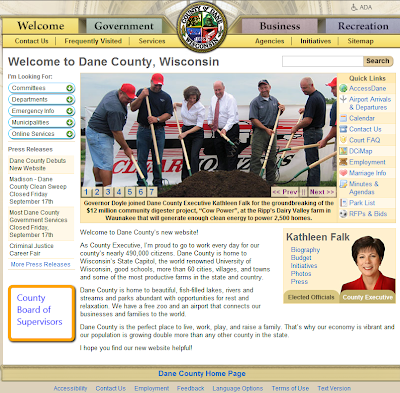
Excerpt: A liberal Dane County Board member is criticizing the county’s new website design as being too focused on County Executive Kathleen Falk.
Sup. Dave de Felice, of Madison, introduced a resolution with 16 co-sponsors at Thursday night’s board meeting calling for the creation of a subcommittee of the Personnel and Finance Committee to review the website.
De Felice said it was hard to find information about the County Board on the home page and noted three of the seven photos in the photo gallery feature Falk at different events, including one with President Barack Obama and one with Gov. Jim Doyle.
Actually, I think it's well-organized.
Four very general tabs share the top of the screen: Welcome (homepage), Government (which also provides a link to the County Board but requires too much scrolling), Business, Recreation.
Six informational tabs are placed just under this group: Contact Us (I sure the website designers determined that this tab needed to be prominently placed), frequently visited, services, agencies, initiatives, sitemap (which, of course, lists the County Board of Supervisors).
Additional links are placed in easy-to-read columns on the left and right sides of the homepage.
The center section offers a statement of welcome from the County Executive, accompanied by a photo and additional links about her. Is there a problem with this? I don't think so. As Dane County's chief executive officer, so to speak, Kathleen Falk is the face of county government.
Finding information about the Dane County Board of Supervisors is a 2-step process.
1. Click on "Elected Officials".
2. Click on "County Board of Supervisors".
And voila! (Uh-oh. Too much Scott McDonnel?)
I do, however, wonder if "Members" would have been a better word choice than "Roster".
But in Dave's defense, there is probably room on the homepage for a "County Board of Supervisors" icon, such as the one found on the Milwaukee County homepage (which includes a photo of Scott Walker) in the lower left-hand corner.
(Not a particularly well-designed website, IMHO. And the top 2 headlines in this screenshot feature the phrase 'County Executive Walker'.)
Anyway, here's the placement suggestion.
Then there's the Mecklenburg County approach.
Static. No changing pictures with captions. No photos of elected officials. An attractive design, tho.
And Winnebago County, Wisconsin.
The homepage features a photo of and message from the County Executive, but you have to click on "Read More" to learn his name.
Subscribe to:
Post Comments (Atom)


No comments:
Post a Comment